-
Elevate Your Presentations: Visualize Data Flows Like a Pro with Sankey Charts
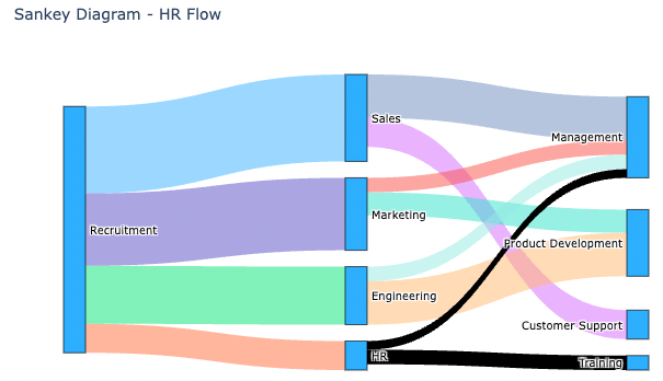
Sankey charts visually represent flows of resources, information, or quantities, using arrow width to show flow magnitude. They are useful for visualizing resource flows, process mapping, cost analysis, supply chain management, and website analytics. To create a Sankey chart, data needs to be structured with source, target, and value. Tools like Vallo simplify the process.
-
Subscribe
Subscribed
Already have a WordPress.com account? Log in now.
