Nvidia
What is a Sankey Chart?
Sankey charts are powerful visual tools used to represent flows of resources, information, or quantities between different entities or stages. Named after Irish engineer Captain Matthew Sankey, who used these diagrams to visualize the energy efficiency of steam engines in the late 19th century, Sankey charts have since evolved to serve a variety of fields—from engineering and environmental science to business and marketing.
The hallmark of a Sankey chart is that the width of the arrows or lines is proportional to the magnitude of the flow they represent. This feature makes it easy to see where the majority of resources or data are concentrated, highlighting major contributors, identifying bottlenecks, and visualizing relationships in complex systems.
Key Elements of a Sankey Chart
- Nodes: Represent the entities, stages, or categories involved in the flow. In a business context, nodes might represent departments, phases, or products.
- Links (Flows): Arrows or lines that connect nodes, showing the direction and quantity of flow between them. The thickness of these links is proportional to the size of the flow they represent, providing immediate visual insights.
When to Use Sankey Charts
Sankey charts are particularly useful in scenarios where understanding the magnitude and direction of flows is critical. They can be used to:
- Visualize Resource Flows: Track how resources like energy, materials, or funds are distributed or consumed across a system.
- Process Mapping: Illustrate how data, tasks, or customers move through a process, helping to identify inefficiencies or bottlenecks.
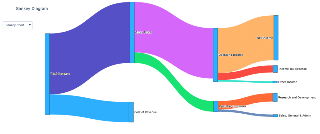
- Cost Analysis: Break down costs into various categories, showing where most funds are allocated or spent.
- Supply Chain Management: Visualize the flow of goods and materials through different stages of production and distribution.
- Website Analytics: Understand user behavior by tracking how visitors navigate through different sections of a website.
Real-World Examples of Sankey Charts
- Energy Management: Visualizing the flow of energy from production sources (coal, solar, wind) to various consumption points (industry, residential use).
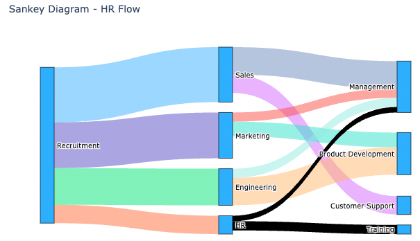
- Human Resources: Tracking employee movements within an organization, such as recruitment sources to departments and from departments to roles like management.
- Marketing Analysis: Mapping the customer journey from initial contact points (email campaigns, social media) to conversions (sales, sign-ups).
- Environmental Studies: Visualizing the distribution of emissions or pollutants across different areas or sectors.
How to Create a Sankey Chart
Step 1: Prepare Your Data
To create a Sankey chart, your data needs to be structured in a specific way. You’ll need:
- Source: The starting point of each flow. In HR, this could be “Recruitment”; in marketing, it could be “Email Campaign.”
- Target: The endpoint of the flow. In HR, this might be “Sales” or “Management”; in marketing, it might be “Website Visit” or “Purchase.”
- Value: The size or magnitude of the flow between each pair of source and target. This shows how many employees moved from one department to another or how many customers took a specific action.
Example Data Structures:
HR Example: Employee Movement Between Departments
| Source | Target | Value |
| Recruitment | Sales | 30 |
| Recruitment | Marketing | 25 |
| Recruitment | Engineering | 20 |
| Recruitment | HR | 10 |
| Sales | Management | 15 |
| Sales | Customer Support | 10 |
| Marketing | Product Development | 8 |
| Marketing | Management | 5 |
| Engineering | Product Development | 15 |
| Engineering | Management | 5 |
| HR | Training | 5 |
| HR | Management | 3 |
Marketing Example: Customer Journey Through Marketing Channels
| Source | Target | Value |
| Email Campaign | Website Visit | 400 |
| Social Media | Website Visit | 600 |
| SEO | Website Visit | 350 |
| Website Visit | Product Page View | 700 |
| Website Visit | Sign-Up | 200 |
| Product Page View | Purchase | 300 |
| Product Page View | Abandon Cart | 100 |
| Sign-Up | Purchase | 100 |
| Abandon Cart | Retargeting | 50 |
| Retargeting | Purchase | 30 |
Step 2: Creating a Sankey Chart
Excel and Google Sheets lack native support for Sankey charts, leading many users to adopt add-ons such as Power BI for Excel and Google Data Studio. Alternatively, Vallo.ai simplifies the process by allowing users to simply input a prompt, and leveraging AI, it instantly generates Sankey charts along with conducting thorough analysis.
Step 3: Customization and Best Practices
To make your Sankey chart as effective as possible, consider these tips:
- Use Color Strategically: Apply different colors to distinguish between various flows and categories. For example, use one color for recruitment sources and another for management roles.
- Ensure Readability: The thickness of lines should clearly indicate the volume of flow. Avoid overly thick or thin lines that could obscure the understanding of data.
- Labeling: Clear labels on nodes and links help viewers understand what each part of the chart represents. Use concise labels and consider tooltips for detailed information.
- Interactivity: If your tool supports it, use interactive features to allow users to hover over nodes or links to get more detailed information. This is particularly useful for presentations or reports.
- Avoid Clutter: Don’t overcomplicate your chart with too many nodes or flows. If the chart becomes too complex, consider breaking it down into multiple Sankey charts to represent different parts of the process.
Treemaps: An Alternative to Sankey Charts
A treemap is a visualization that uses nested rectangles to show hierarchical data, with each rectangle’s size representing the proportion of a category. Treemaps are great for displaying part-to-whole relationships, making it easy to compare the size of different categories. While Sankey charts are ideal for visualizing flows and connections, treemaps offer a powerful alternative for understanding hierarchical relationships and proportions within a dataset.
Comparison Between Sankey Charts and Treemaps
| Feature | Sankey Chart | Treemap |
| Purpose | Visualize flows between entities. | Show hierarchical proportions. |
| Visual | Arrows with varying thickness. | Nested rectangles sized by value. |
| Best For | Tracking flow and connections. | Comparing sizes within hierarchies. |
| Examples | Energy distribution, user paths. | Market share, sales by category. |
When to Use Each:
- Sankey Charts: Use for visualizing flows, such as resource distribution or customer journeys.
- Treemaps: Use for comparing sizes within a hierarchy, like market share or traffic analysis.
Conclusion
Sankey charts make it easy to see how data flows and where resources go, turning complex information into clear, actionable insights. Whether you’re tracking resource allocation or mapping customer journeys, these charts help you make smarter decisions. And with tools like Vallo, creating and tweaking Sankey charts is quick and hassle-free, letting you dive straight into the insights.

Leave a comment